Overview
Colleges and universities relied on the platform to track program performance and demonstrate compliance with accreditation standards—yet key workflows were confusing and underutilized, limiting the platform’s effectiveness.
I contributed to redesigning critical user flows and introducing new features that simplified report creation, improved usability, and increased engagement across stakeholders.
Impact
10% increase in monthly active users
Indicating higher engagement and more sustained usage
Indicating higher engagement and more sustained usage
22% increase in customer satisfaction ratings
Reflecting improved usability and overall experience
Reflecting improved usability and overall experience
Improved task completion for report creation
Users were able to generate the required reports more efficiently and with less confusion
Users were able to generate the required reports more efficiently and with less confusion
Increased adoption among faculty users
Reduced friction contributed to broader platform usage
Reduced friction contributed to broader platform usage
My Role
Contributed to UX design for key feature enhancements within a SaaS analytics platform
Conducted user research with active platform users to identify usability gaps
Designed wireframes and interactive prototypes to improve core workflows
Collaborated with senior designers to refine and deliver final UI solutions
Context & Challenge
The platform served higher education institutions navigating increasing pressure to demonstrate compliance with accreditation standards. While the system provided robust data, usability challenges limited its effectiveness:
Core workflows (like report creation) were difficult to navigate
Information architecture did not align with user expectations
Adoption among faculty and stakeholders was inconsistent
The challenge was to reduce friction in critical workflows while making complex academic data more accessible and usable across diverse user groups.
Key Insights
Users struggled with mismatched mental models
The system’s structure did not align with how users expected to complete tasks (e.g., creating reports)
The system’s structure did not align with how users expected to complete tasks (e.g., creating reports)
Critical actions were buried in non-intuitive locations
Users frequently navigated to the wrong areas, increasing frustration and task time
Users frequently navigated to the wrong areas, increasing frustration and task time
Workflow friction impacted adoption
Difficulty completing key tasks discouraged broader use across the faculty
Difficulty completing key tasks discouraged broader use across the faculty
Engagement required both usability and approachability
The platform needed to feel not just functional, but inviting to encourage repeat use
The platform needed to feel not just functional, but inviting to encourage repeat use
Design Approach
1. Aligning Navigation with User Intent
I focused on restructuring access points so that key actions—like report creation—were available where users expected them.
2. Reducing Workflow Friction
I identified points of confusion in the reporting flow and simplified the steps required to complete critical tasks.
3. Supporting Multiple Paths to Completion
Recognizing different user behaviors, I designed flexible entry points that allowed users to complete tasks in more than one way.
4. Increasing Engagement Through Approachability
I explored lightweight visual and interactive enhancements to make the platform feel more engaging without compromising usability.
Solution
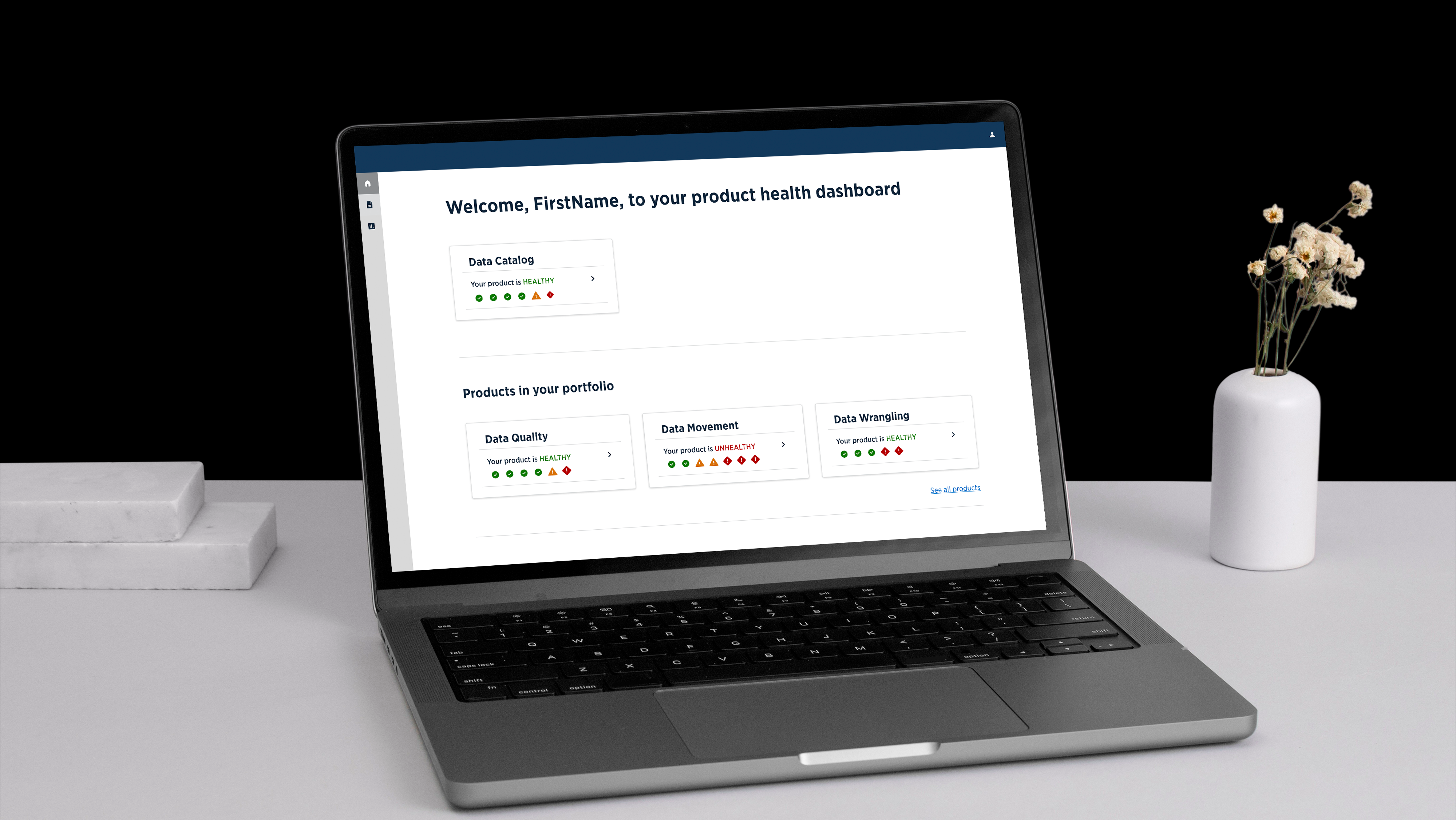
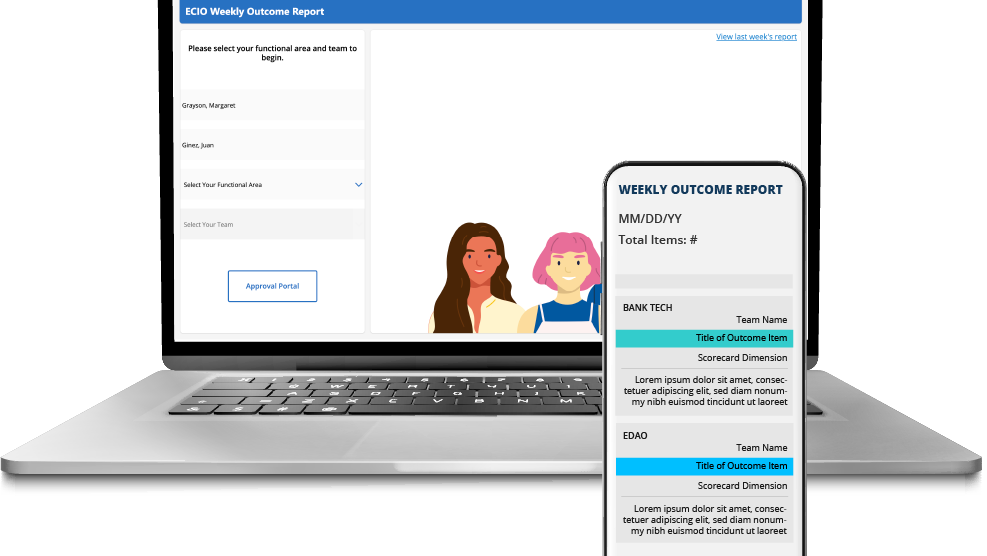
Introduced a “Quick Report” feature directly within the Reports section, allowing users to generate reports without navigating through unrelated workflows
Simplified and clarified navigation to better match user expectations
Enhanced the interface with approachable visual elements and profile customization options to encourage engagement
These changes reduced friction in a core workflow while making the platform more intuitive and accessible.